Contents:
- Comparing overall indicators
- Comparing data in the sources of conversions to Google and 2GIS (URBI) cards
- Comparing impressions by search phrases
To compare online presence analytics with another period, all sections, except for Synchronization at platforms, have Compare periods filter.
Click on it and select the necessary option from the drop-down list:
- Previous period - displays data for the same dates but a month ago. E.g., if the current period is from 11.01.2023 to 10.02.2023, another period shown will be from 11.12.2022 to 10.01.2023.
- Previous year - displays data for the same dates but a year ago. E.g., if the current period is from 11.01.2023 to 10.02.2023, another period shown will be from 11.01.2022 to 10.02.2022.

After selection, two fields will appear: Period A and Period B, where you can choose your dates.
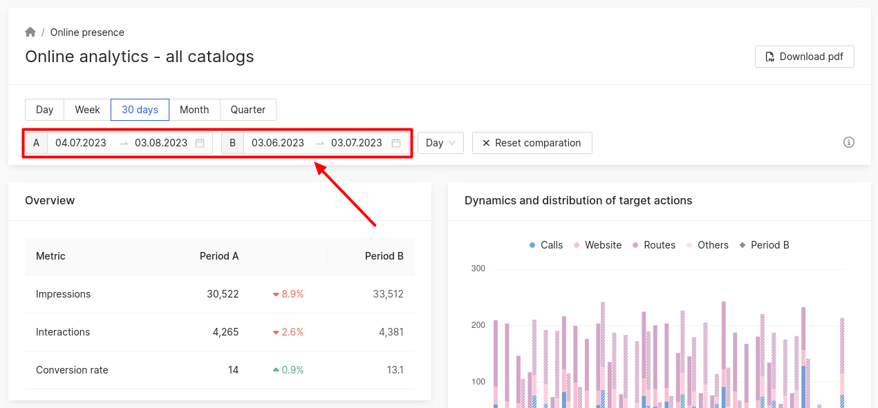
Comparing overall indicators
In Overview block, you can learn the following data on all companies compared to some other period:
- Total impressions of cards in catalogs.
- Interactions - a number of searches for routes, calls, site visits, etc.
- Conversion rate: percentage of interactions to impressions.
Dynamics of indicators will also be displayed:
- The value in red with downward shows arrow how much the indicator has decreased.
- The value in green with upward arrow shows how much the indicator has increased.
Dynamics and distribution of target actions block shows the graph, as well as summary of all calls, site visits, built routes and others for all companies per each day/week/month of the selected period
Diagram for Period B is shown by dash.
Dynamics of indicators is displayed in the summary:
- The value in red with downward arrow shows how much the indicator has decreased.
- The value in green with upward arrow shows how much the indicator has increased.
When you hover over the chart, it displays the number of each action per day that belongs to period A and the corresponding day in period B, as well as the dynamics of the indicators in percentage terms:
- The value in red with downward arrow shows how much the indicator has decreased.
- The value in green with upward arrow shows how much the indicator has increased.
Impressions block displays a graph with total impressions for all companies per each day/week/month of the selected period compared to another one.
Diagram for Period B is shown by dash.
Comparing data in the sources of conversions to Google and 2GIS (URBI) cards
There is a diagram in Sources of conversions to cards block. The color of its segments corresponds to a certain source of conversions to the card in the catalog for the selected period compared to another one.
- Period А diagram is displayed on the left.
- Period B - on the right.
To see the number of conversions from a certain source, hover the cursor over the diagram segment corresponding to the color of the needed source.
In addition, the number of conversions from each source is shown in the summary below the diagram for the first and second period.
Dynamics of indicators is displayed in the summary:
- The value in red with downward arrow shows how much the indicator has decreased.
- The value in green with upward arrow shows how much the indicator has increased.
Comparing impressions by search phrases
This section displays a list of phrases the users entered to the search line and saw your company in the search output in the selected period compared to another one.
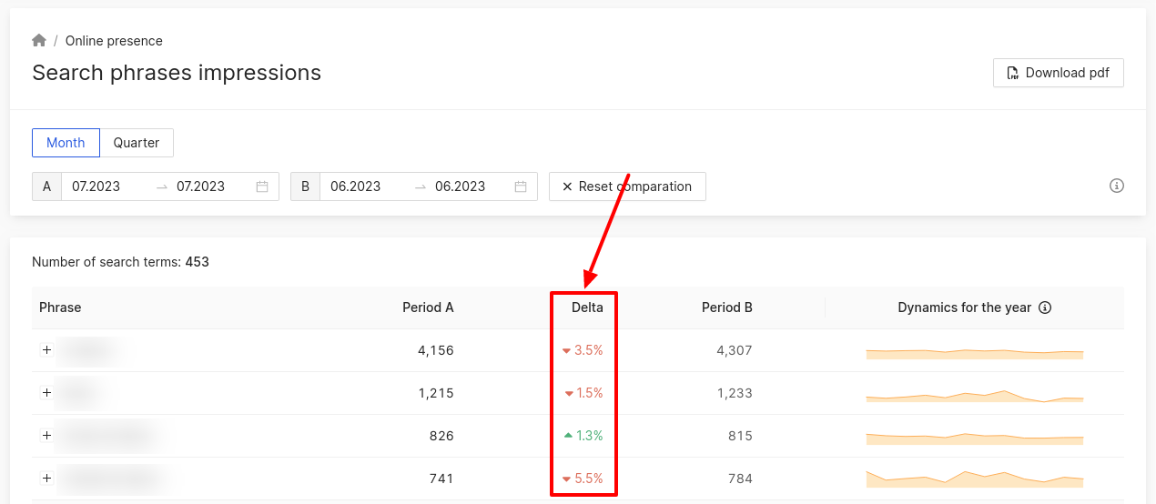
Attention! Dynamics of yearly indicators does not depend on the selected filters!
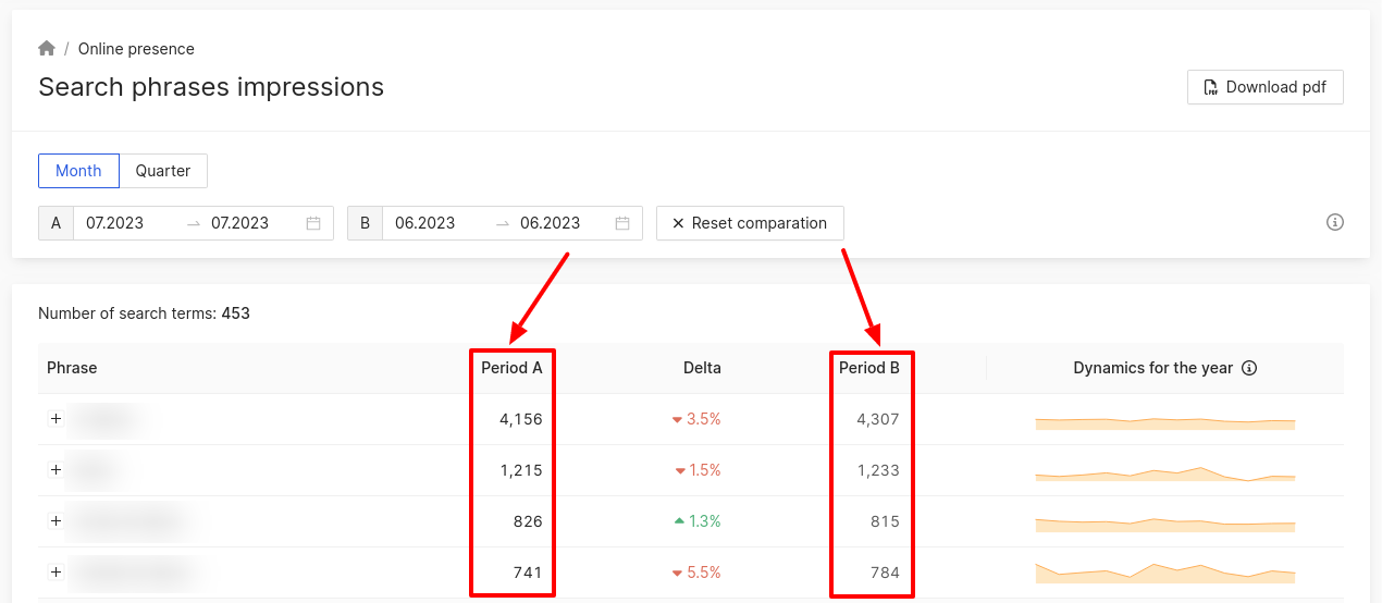
Dynamics of indicators is displayed in the summary:
- The value in red with downward arrow shows how much the indicator has decreased.
- The value in green with upward arrow shows how much the indicator has increased.
Learn more about Impressions by search filters here.
How to download analytical data, can be found further.