On the position distribution chart, you can analyze the positions where your companies are most frequently found in search results for users.
First, you can customize the data display: by days, by weeks, or by months.If the filter is set By Days, the data for each day of the last month will be displayed. IF By Week - for the last 3 months in the context of the week. By Month - for the last year.
Attention!
- If pickup happens once a week, filtering By days will not be available.
- If pickup happens once a month, filtering By days and By weeks will not be available.
You can also select the sources from which the positions were recorded:
- Search Google - for search in Google web only.
- Maps Google - data will be displayed for search in Google maps only.
- Search Yandex - for search in Yandex web only.
- Maps Yandex - data will be displayed for search in Yandex maps only.
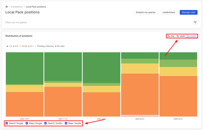
On the chart:
- The x-axis displays the day/week/month for which the position data is presented.
- The y-axis shows your company's ranking in the search results for that specific day/week/month.
The position numbers are shown in different colors for easier data analysis:
- The green color shows positions from 1 to 5.
- Light green - from 6 to 9.
- Yellow - from 10 to 20.
- Orange - from 21 and up.
- Gray - pending collection. Collection is still ongoing for these positions, information will be displayed soon.
- Red - no data. There was a failure for these positions and the results will be unavailable.
To find out the percentage of positions on a particular day, you need to hover the cursor over the column in the chart that corresponds to the selected date.
What is displayed in the pickup results, you can find out further.